QC reports are not available for custom organisms.
Genes types are based on ENSEMBL classification.
75th percentile of normalized expression by chromosomes.
Overview
The Pre-Process tab prepares expression data for downstream analysis. The workflow (1) filters genes with negligible expression, (2) converts uploaded identifiers to Ensembl or STRING IDs, and (3) applies appropriate transformations so comparisons across samples are meaningful. Each option in the sidebar updates the preview plots and summaries in real time.
Data Preparation Steps
- Upload & inspect: view table previews and basic statistics for the uploaded matrix before any filtering.
- Filter low expression: remove genes that fail CPM/FPKM thresholds so that noise does not dominate clustering or differential expression analysis.
- Transform counts: choose among VST, rlog, or log2 with a pseudo-count to stabilize variance across samples.
- Confirm quality: boxplots, density plots, and interactive tables help validate that processing choices produce sensible distributions.
Filtering Counts Data
RNA-seq counts are normalized to counts per million (CPM) using edgeR. By default a gene must exceed 0.5 CPM in at least one sample (adjustable via minCPM and n libraries). Genes failing this requirement are discarded, which commonly removes 30–50% of the genome where expression is undetectable in the chosen tissue.
Increase the CPM threshold when sequencing depth is high to keep only robust signals, or loosen it (e.g., 0.2 CPM for 50M-read libraries) to save low but potentially important transcripts. The settings also determine whether iDEP issues warnings about a very small number of retained genes (< 1,000 by default) because that affects enrichment background calculations.
Transformations for Counts Data
After filtering, select the transformation that best matches the study design. The transformed matrix powers clustering, PCA, t-SNE, and optional limma-trend analysis.
- Variance Stabilizing Transform (VST): moderates the variance of highly expressed genes according to Anders & Huber (2010). Good default for moderate sample sizes.
- rlog: regularized log transform from DESeq2. Produces balanced distributions but is slower for >10 samples.
- Log2(x + c): adds a pseudo-count c (default 4) to stabilize low counts. This is equivalent to logCPM if libraries were scaled to 1M reads; iDEP instead uses DESeq2’s size factors before applying the log.
Inspect the transformation effects using the technical replicate plots and density views. Aggressive transformations can shrink biological differences, whereas minimal transformation leaves heteroscedastic noise in place.
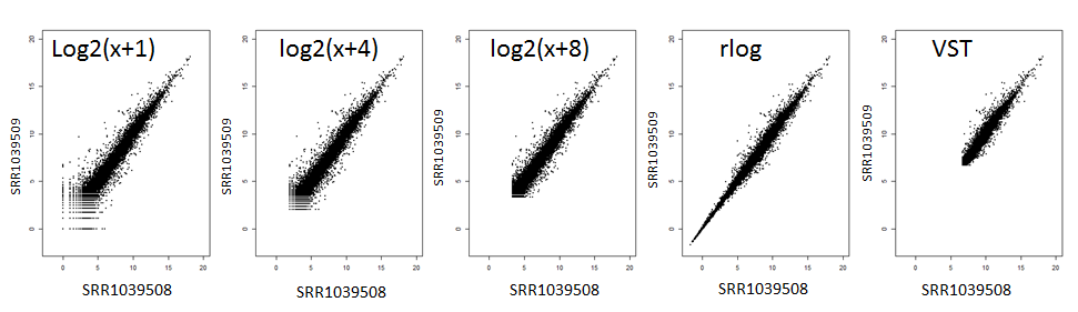
The figure above compares technical replicates before and after applying VST, rlog, or a simple log transform. Notice how VST compresses the range most aggressively, while rlog and log2(x + c) retain slightly more spread. Use it as a guide: if your replicates look similar to the middle panel you are removing unwanted noise without flattening real biology.
Normalized Expression (FPKM, TPM, Microarray)
For already normalized matrices, filtering relies on absolute expression thresholds rather than CPM. The default keeps genes expressed at level ≥ 1 in at least one sample; adjust the value to reflect the measurement scale. For microarray log-ratio data, set the cutoff to a large negative number to disable filtering entirely.
iDEP automatically evaluates kurtosis across samples and recommends log2 transformation when extremely skewed values are detected. This safeguard reduces the impact of single outlier arrays or normalization artifacts.

This bar chart highlights an experiment where certain groups received far fewer reads. When the tallest bar is more than three times the height of the shortest one, downstream methods like limma-trend can become unreliable. In those cases consider alternative differential expression workflows or revisit library preparation and sequencing balance.
Gene ID Conversion
Once filtering and transformation options are set, iDEP maps uploaded gene identifiers to Ensembl or STRING IDs using the selected species database. A summary of matched and unmatched IDs appears in the data preview so you can confirm coverage before moving on to downstream tabs.
Quality Diagnostics
- Boxplot: compares sample distributions before and after transformation. Large shifts may indicate the need for alternative pseudo-counts or normalization choices.
- Density plot: visualizes overall expression patterns and highlights whether technical replicates overlap. The figure width adapts to the browser window.
- Data table: toggles between transformed and raw counts for spot-checking individual genes.
Quick Tips
- Start with default filters, then relax thresholds gradually if too few genes pass.
- Use the Tukey HSD option on boxplots to flag sample groups with significant mean differences before committing to downstream analyses.
- Keep an eye on library-size plots; if one group has >3× fewer reads, avoid limma-trend for differential expression.
- After major adjustments, regenerate the report from the sidebar to capture chosen parameters.
References
- Anders, S. & Huber, W. (2010). Differential expression analysis for sequence count data. Genome Biology 11(10):R106.
- Love, M. I., Huber, W. & Anders, S. (2014). Moderated estimation of fold change and dispersion for RNA-seq data with DESeq2. Genome Biology 15(12):550.
- edgeR User Guide: https://bioconductor.org/packages/edgeR
Cutoff:
Two pathways (nodes) are connected if they share 30% (default, adjustable) or more genes. Green and red represents up- and down-regulated pathways. You can move the nodes by dragging them, zoom in and out by scrolling, and shift the entire network by click on an empty point and drag. Darker nodes are more significantly enriched gene sets. Bigger nodes represent larger gene sets. Thicker edges represent more overlapped genes.
Note: In the gene type column, "C" indicates protein-coding genes, and "P" means pseudogenes.
Details of Enrichment Analysis
Generate a word cloud of pathways that contain genes from the
selected cluster (Must run clustering with heatmap first).
Words are ranked by frequency.
Data Download
Using genes with maximum expression level at the top 75%. Data is transformed and clustered as specified in the sidebar.
Overview
The Clustering tab offers several tools to explore overall expression patterns. Genes are ranked by their across-sample variability, and the top genes enter a heatmap that supports both hierarchical clustering and k-means clustering. Sample-level dendrograms, pathway word clouds, and gene standard deviation plots help interpret the dominant trends in the dataset.
Heatmap
The interactive heatmap displays the standardized expression matrix for the selected number of high-variance genes. Switch between hierarchical and k-means clustering to reorganize the rows and columns. When hierarchical clustering is active, the sidebar controls let you tune several parts of the algorithm:
- Distance metric: choose among Euclidean, Pearson, and other options to decide how similarity between genes or samples is measured before clustering.
- Linkage method: adjust how clusters merge (average, complete, single, etc.). Tight clusters often emerge with complete or average linkage, whereas single linkage can highlight chain-like relationships.
- Dendrogram visibility: pick whether to display sample branches, gene branches, both, or hide them entirely when you already know the ordering.
- Gene centering/normalizing: enabling centering subtracts each gene’s mean, while normalization divides by its standard deviation. Together these settings emphasize relative changes and ensure genes with large absolute counts do not dominate the color scale.
- More Options panel: expand this section to adjust the color palette for sample annotations and to cap the heatmap at a chosen maximum Z-score. Palette changes help align figures with your publication style, while lowering the Z-score cap prevents a few extreme values from washing out moderate differences elsewhere in the map.
For k-means clustering choose the desired number of clusters and, if the results are unstable, re-run the algorithm with a new random seed. Use the brush tool to zoom into a portion of the heatmap, or click on rows to view gene-level expression details beneath the heatmap. Optional enrichment analysis summarizes the functional themes within the selected cluster.
- Number of clusters: move the slider to adjust how many k-means groups are formed. Small values reveal broad trends, while larger values expose finer substructures.
- New Seed: rerun the algorithm with a different random initialization to check whether clusters are stable.
- How many clusters? open the elbow plot to inspect the within-cluster sum of squares across k values. Look for the elbow point where additional clusters bring diminishing returns.
Sample Colors and Annotations
Sample annotations imported during preprocessing appear as colored bars on the heatmap. Choose a single factor or display all available annotations, and change the color palette to match your figures. Adjusting the maximum Z-score truncates extreme values so that subtle expression differences are more visible.
Word Cloud
After generating the heatmap, open the Word Cloud sub-tab to visualize the pathways associated with a selected cluster. Words are sized by frequency across pathway descriptions, highlighting enriched biological themes.
Gene SD Distribution
The Gene SD Distribution panel plots the distribution of gene-level standard deviations. This helps assess whether the current variance filter is too strict or too permissive, and provides a quick check for highly variable genes that might influence clustering results.
Sample Tree
The Sample Tree tab clusters samples using genes with expression above the 75th percentile. It uses the same distance metric and transformation options selected for the heatmap, making it a complementary view of how samples segregate under the current preprocessing choices.
Tips
- Increase the number of genes when broad patterns are unclear; decrease it to focus on the strongest signals.
- Turn on gene centering and scaling to emphasize relative changes when absolute expression levels vary widely across genes.
- Use the enrichment toggle after selecting clusters to quickly assess biological relevance.
- Export figures or underlying data from each panel with the download controls located near the plots.
- Zoom in on the main heatmap to inspect a subset of genes before running enrichment on the selected region.
- After zooming, use the enrichment toggle to summarize pathways for the highlighted cluster.
- If the main and sub heatmaps overlap, widen your browser window to give each plot more room.
Overview
The PCA tab is a quick way to see which samples behave alike and which ones stand out. It condenses the thousands of genes measured in your experiment into easy-to-read plots, so you can spot patterns without any coding or statistics.
Principal component analysis (PCA) works by re-arranging the data so that the biggest differences between samples appear on the horizontal and vertical axes. When two samples sit close together on the plot they share similar gene-expression profiles. Samples that land far apart are reacting differently to the conditions in your study. Each axis label includes the percentage of "variation" it captures—higher percentages mean that axis is explaining more of the overall differences between samples.
2D PCA Plot
The first panel shows an interactive two-dimensional scatter plot. Use the drop-down menus in the sidebar to choose which axes (principal components) you want to view. You can color or shape the points by any sample annotation, such as treatment group, time point, or tissue type, to check whether your experimental design explains the separation you see.
How to interpret the plot:
- Samples that cluster together likely responded similarly and can be considered consistent replicates.
- If a supposed replicate falls far from the others, double-check that sample for labeling or quality issues.
- Separation between treatment groups suggests that the intervention had a measurable effect on global expression patterns.
- Hover your mouse over a point to see the sample name and group.
- The text below the plot highlights which sample annotations align most strongly with the current axes.
- Use the download button to save the plot with custom dimensions for presentations or reports.
3D PCA
The 3D tab shows a rotating three-dimensional version of the PCA plot. Pick any three components and drag the plot to view it from different angles. The color and shape options you chose in the sidebar carry over automatically.
- Use the toolbar inside the plot to rotate, zoom, or capture a snapshot.
- 3D views are especially helpful when two groups overlap in 2D but separate when a third axis is added.
PCAtools Suite
Additional tabs powered by the PCAtools package provide deeper diagnostics:
- Biplot: adds arrows showing which genes influence sample placement. Enable loadings in the sidebar to reveal these drivers.
- Scree and variance plots: display how much variation each principal component explains, helping you decide how many components to keep in downstream work.
- Eigencor plot: compares each component against your sample annotations (for example, treatment or batch) and highlights strong relationships.
MDS and t-SNE
The MDS and t-SNE tabs offer alternative views of the same processed data. MDS (multidimensional scaling) focuses on overall distances, while t-SNE is a nonlinear method that can uncover tight clusters.
- Click Re-calculate on the t-SNE tab to try a new random seed if the clusters look unstable.
- Download options under each plot let you save the figures or the data points for further exploration.
Reports and Data
Buttons in the sidebar generate an HTML summary of the PCA results and let you download the PCA scores table. The table is useful for custom plots or for cross-checking how individual samples load onto each component.
Quick Tips
- Try several axis combinations—important biology can appear on later components, not just PC1 vs PC2.
- Match colors and shapes with your experimental design so clusters are easier to explain to collaborators.
- Use the PCAtools scree plot to justify how many components you keep in downstream analysis or presentations.
- If clusters are unclear, consider returning to the Pre-Process tab to adjust filtering or transformations and re-run PCA.
- Widen your browser window or collapse the sidebar if plots feel crowded.
Numbers of differentially expressed genes for all comparisons. "B-A" means B vs. A. Interaction terms start with "I:"
The above graph is an UpSet plot that is an alternative to a venn diagram. The plot shows the intersections of the data in the combination matrix (bottom) and the columns show how many genes are in each intersection.
More info on plot
Overview
The Stats tab is where you define statistical comparisons (contrasts) and run differential expression analysis. After Stats finishes, the DEG tab lets you explore each contrast in detail using tables, plots, and enrichment tools. Think of Stats as the engine that creates the comparison results, and DEG as the dashboard that helps you interpret them.
Getting Started
Begin on the Experiment Design sub-tab. If you uploaded only a gene expression matrix, iDEP infers sample groups directly from the column names (for example, Control_1, Treat_1). If you also provided a design file, the additional columns appear as selectable factors. Use the drop-down lists to choose which annotations define your contrasts and, when needed, specify reference levels or block factors (paired samples, batches, donors). The model formula shown on this page is exactly what will be sent to DESeq2 or limma, so you can confirm it matches your experimental plan.
- Factors: choose categorical variables such as treatment, genotype, tissue, or timepoint. These determine the comparisons that will be generated automatically.
- Block factors: optional; use them for paired or repeated measurements so subject-to-subject variability is accounted for.
- Reference levels: pick the baseline category (for example, Control). Contrasts are expressed as “B vs A”, which means A is the denominator/baseline and positive fold changes indicate higher expression in B relative to A.
- Interaction terms: enable them if you want to test whether the effect of one factor depends on another (e.g., genotype × treatment).
Building and Interpreting Contrasts
Contrasts define the specific comparisons you want to test. Once you choose a factor, iDEP automatically creates pairwise contrasts between its levels. For example, if Treatment includes Control and Drug, Stats will compute “Drug vs Control”. When only two groups exist, that is the sole contrast and Stats models the fold change of Drug relative to Control. If you include two factors and enable their interaction, DESeq2/limma can also test whether the effect of one factor depends on the other.
Example: genotype × treatment (2×2). Suppose you measure gene expression in wild-type and mutant cells, each with and without drug exposure. Select both Genotype and Treatment as factors. Stats generates contrasts such as “Mutant vs WT” (averaged across treatments), “Drug vs Control” (averaged across genotypes), and—if you turn on the interaction— “I:Genotype:Treatment”. A significant interaction indicates the drug response in mutants differs from wild type, a common question in pharmacogenomics studies.
For simpler studies with only a few sample groups, use the Model comparisons list on the Experiment Design page to pick exactly which pairs you want. For instance, with three groups (Control, DrugA, DrugB) you can uncheck unwanted contrasts and keep only “DrugA vs Control”. Remember that “DrugA vs Control” reports fold change relative to Control, so positive values indicate higher expression in DrugA.
Controlling batch effects. Add columns such as Batch, Patient, or SequencingRun to your design file and select them as block factors. The model (~ Batch + Treatment) accounts for these systematic differences without producing separate contrasts for them, reducing false positives caused by technical variation.
Other real-world scenarios. Time-course experiments can treat Time and Treatment as factors, enabling contrasts such as “12h vs 0h” and interaction terms that reveal time-dependent treatment effects. For paired clinical samples (tumor vs matched normal), include the patient ID as a block factor so inter-patient variability is removed before testing the tumor vs normal contrast.
Choosing a Method
The Method menu appears when you uploaded raw counts. Select:
- DESeq2 (default): robust for most RNA-seq experiments and recommended whenever you have access to raw counts. Modelling counts directly gives the method full information about sequencing depth and dispersion.
- limma-voom: useful for larger studies or when mean–variance trends need extra modeling.
- limma-trend: recommended for already normalized expression data such as microarrays. Avoid it when library sizes differ by more than ~3×.
If you only have normalized values (FPKM, TPM, log ratios), Stats can still run using limma-trend, but you lose some sensitivity compared with modelling raw counts. Whenever possible, upload the original count matrix and analyze it with DESeq2.
Additional switches appear based on the method:
- Threshold-based Wald Test: DESeq2 option that tests whether fold changes exceed the value entered in Min fold-change.
- Independent filtering: removes very low-count genes so more truly regulated genes pass the FDR cutoff.
Significance Filters
- FDR cutoff: sets the maximum adjusted p-value for calling a gene significant. Common choices are 0.05 or 0.1.
- Min fold-change: requires genes to change by at least the specified factor (not log scale). Enter 2 to focus on genes with ≥2-fold shifts.
After configuring options, click Submit to run Stats. A notification appears when results are ready. If you make changes, submit again to refresh the analysis.
Results Summary
Once Stats finishes, switch to the Results sub-tab to review the number of up- and down-regulated genes for every contrast. Download the table or the summary graphic for reports. These contrasts feed directly into DEG.
The Venn Diagram sub-tab visualizes gene list overlaps across contrasts. Use the check box to split results into upregulated and downregulated sets before exporting figures with the download buttons.
The Venn Diagram view is best when you have two to four contrasts and want to see shared genes quickly. If you selected more contrasts, the UpSet plot (displayed underneath) summarizes the same overlaps in a bar-chart layout that stays readable for larger numbers of comparisons.
The R Code sub-tab reveals the exact DESeq2/limma commands used so you can reproduce the analysis offline.
Copy the script from R Code or use the download button to save it as
an .R file. Running this script locally lets you tweak advanced
settings beyond the graphical interface while keeping your analysis fully
documented.
Quick Tips
- Keep factor names short and meaningful; they appear in contrast labels and plots.
- When you only care about one or two contrasts, uncheck the others in the model comparison list to speed up Stats and keep reports focused.
- Use block factors whenever samples are matched pairs (before/after, left/right, repeated donors).
- If Stats errors out, double-check that every factor level has sufficient replicates and that interaction terms are supported by the sample size.
- Save time by downloading Stats results once and reusing them in DEG, pathway, and enrichment tabs without rerunning the model.
Cutoff:
Two pathways (nodes) are connected if they share 30% (default, adjustable) or more genes. Green and red represents up- and down-regulated pathways. You can move the nodes by dragging them, zoom in and out by scrolling, and shift the entire network by click on an empty point and drag. Darker nodes are more significantly enriched gene sets. Bigger nodes represent larger gene sets. Thicker edges represent more overlapped genes.
Note: In the gene type column, "C" indicates protein-coding genes, and "P" means pseudogenes.
Details of Enrichment Analysis
Overview
The DEG tab helps you inspect each contrast produced in Stats. Select a comparison to review significant genes, visualize fold changes, and run enrichment analyses. Stats defines the comparisons; DEG explains what each comparison means biologically.
Selecting a Contrast
Use the menu on the left to pick any contrast from Stats. Labels follow the “B-A” convention (for example, “Drug-Control”), meaning fold changes are calculated relative to the baseline group (Control in this example). Interaction contrasts start with “I:” and test whether the effect of one factor depends on another.
Heatmap
The default view is a clustered heatmap of differentially expressed genes. Choose how many genes to display and whether to sort them by fold change or FDR. Download buttons provide both the image and the underlying expression matrix for custom plots or reporting.
Volcano, MA, and Scatter Plots
- Volcano plot: highlights genes with large fold changes and strong statistical support. Use the labeling controls to tag genes of interest.
- MA plot: shows fold change versus mean expression, making it easy to spot intensity-dependent effects.
- Scatter plot: compares fold changes between two contrasts when both are available, helping you see shared responses.
Each plot offers download options so you can save high-resolution figures or export the data points behind them.
Enrichment
The Enrichment tab connects directly to the pathway analysis module. For the selected contrast, you can run GO, pathway, and TF/miRNA target enrichment. This helps translate lists of DEGs into biological processes and regulatory themes. Adjust settings exactly as you would elsewhere in iDEP.
R Code
DEG also provides the R script used to generate plots and tables. Download it if you want to customize visualizations or rerun the analysis offline.
Tips
- If a contrast is missing, return to Stats and confirm it was selected in the Experiment Design page before rerunning the analysis.
- Interpret fold changes with the baseline in mind; “Drug-Control” reports expression in Drug relative to Control.
- Use the heatmap download to share gene clusters with collaborators or feed selected genes into downstream pathway tools.
Adjusting the width of the browser window can render figure differently and resolve the "Figure margin too wide" error.
Connected gene sets share more genes. Color of node correspond to adjusted p-values.
Cutoff:
Two pathways (nodes) are connected if they share 30% (default, adjustable) or more genes. Green and red represents up- and down-regulated pathways, respectively. You can move the nodes by dragging them, zoom in and out by scrolling, and shift the entire network by click on an empty point and drag. Darker nodes are more significantly enriched gene sets. Bigger nodes represent larger gene sets. Thicker edges represent more overlapped genes.
Please select KEGG database, if available, from left and perform pathway analysis first.
Overview
The Pathway tab reuses the fold-change values generated in Stats to score every pathway or gene set in the selected database. Because it analyses the full set of genes (not just the significant list), it can reveal coordinated but modest expression shifts that DEG enrichment might miss.
This approach differs from the enrichment tools under DEG, which only examine genes classified as up- or down-regulated. Pathway analysis here considers the entire ranked list of genes, so pathways may surface even when individual genes do not pass DEG thresholds.
Getting Started
- Click Submit after choosing a contrast and method; results update only when the button is pressed.
- Use the Comparison selector to pick a Stats contrast (“B-A” indicates fold change relative to A) or choose “All samples” for PGSEA with all groups.
- Select a Pathway analysis method and, if prompted, its specific options (for example, the GAGE metric).
- Choose the Gene-set database (GO, KEGG, Reactome, TF/miRNA targets, etc.) from the dropdown rendered beneath the method selector.
Sidebar Controls
- Pathway significance cutoff (FDR): filters results to pathways with adjusted p-values at or below the chosen threshold.
- More options: reveals extra sliders/toggles such as gene-set size limits, number of top pathways to show, and the gene-level FDR filter applied before analysis.
- Gene-set size (Min/Max): exclude sets that are too small (often noisy) or too large (overly generic).
- Number of top pathways: controls how many entries appear in the summary tables and plots.
- Remove genes with big FDR: discards genes whose Stats adjusted p-values exceed the specified threshold before pathway scoring.
- Use absolute values of fold changes: treats up- and down-regulation equally (useful for pathways where mixed regulation indicates activation, such as signaling cascades).
- Show pathway IDs: appends identifiers (for example, GO terms or KEGG IDs) to pathway names in the output.
- Report / Heatmap data: download an HTML report of all results or the expression matrix used in the pathway heatmap.
- PGSEA color palette: when using PGSEA, choose the color scheme applied to the sample-by-pathway heatmap.
Method Details
- GAGE: evaluates pathway-level fold changes using either Stats fold changes or expression values. It can contrast up- and down-regulated pathways separately via the Network tab filters.
- GSEA (fgsea): runs fast preranked enrichment by ordering genes on fold change. Scores reflect whether pathway members accumulate toward the top or bottom of the ranked list.
- PGSEA: computes average expression shifts for pathways on a per-comparison basis. “PGSEA w/ all samples” generates a sample × pathway matrix for exploratory clustering.
- ReactomePA: performs Reactome-focused enrichment and provides pathway relationship plots via the Enrichment tab.
- GSVA/ssGSEA/PLAGE: single-sample scoring methods that transform the expression matrix into per-sample pathway scores, ideal for comparisons across multiple groups or time points.
- Pathview: when KEGG is selected, overlays fold changes onto KEGG diagrams for the chosen pathway.
Output Tabs
- Significant pathways: table of enriched pathways with download links for the CSV summary and leading-edge gene lists.
- Tree: hierarchical clustering of pathways based on shared genes. Use browser width to tame size warnings and download a static figure.
- Network: interactive graph where nodes are pathways. Adjust the edge cutoff (shared gene fraction), toggle text wrapping, switch layouts, and—for GAGE/GSEA—filter to up- or down-regulated pathways.
- Heatmap: visualizes the expression of genes driving each pathway. The “Heatmap Data” download contains the matrix used for plotting.
- KEGG: once KEGG is selected as the database and the analysis has run, pick an enriched pathway to render a colored KEGG diagram. Options let you include all KEGG pathways, adjust colors, and download the image.
- Info: opens this documentation within the app.
Interpretation Tips
- Compare outputs from multiple methods to confirm robust signals—no single method is best for every dataset.
- Remember that enrichment suggests association, not necessarily direct pathway activation; cross-check with biological context or external databases.
- Use the Network and Tree tabs to spot clusters of related pathways that may point to overarching processes (for example, immune activation or metabolism).
- When Pathview is slow, queue it after other analyses or limit the number of pathways requested.
- Guard against “P-hacking”: repeatedly tweaking databases, filters, and methods can produce pathways that appear significant by chance. Treat marginal p-values with caution and focus on patterns that replicate across contrasts or datasets.
References
Fabregat, A., Sidiropoulos, K., Garapati, P., Gillespie, M., Hausmann, K., Haw, R., Jassal, B., Jupe, S., Korninger, F., McKay, S., et al. (2016). The Reactome pathway Knowledgebase. Nucleic Acids Res 44, D481-487.
Furge, K., and Dykema, K. (2012). PGSEA: Parametric Gene Set Enrichment Analysis. R package version 1480.
Kanehisa, M., Furumichi, M., Tanabe, M., Sato, Y., and Morishima, K. (2017). KEGG: new perspectives on genomes, pathways, diseases and drugs. Nucleic Acids Res 45, D353-D361.
Kim, S.Y., and Volsky, D.J. (2005). PAGE: parametric analysis of gene set enrichment. BMC Bioinformatics 6, 144.
Luo, W., and Brouwer, C. (2013). Pathview: an R/Bioconductor package for pathway-based data integration and visualization. Bioinformatics 29, 1830-1831.
Sergushichev, A. (2016). An algorithm for fast preranked gene set enrichment analysis using cumulative statistic calculation. bioRxiv http://biorxiv.org/content/early/2016/06/20/060012.
Subramanian, A., Tamayo, P., Mootha, V.K., Mukherjee, S., Ebert, B.L., Gillette, M.A., Paulovich, A., Pomeroy, S.L., Golub, T.R., Lander, E.S., et al. (2005). Gene set enrichment analysis: a knowledge-based approach for interpreting genome-wide expression profiles. Proc Natl Acad Sci U S A 102, 15545-15550.
Yu, G., and He, Q.Y. (2016). ReactomePA: an R/Bioconductor package for Reactome pathway analysis and visualization. Mol Biosyst 12, 477-479.
Select a region to zoom in. Mouse over the points to see more information on the gene. Enriched regions are highlighted by blue or red line segments parallel to the chromosomes.
Mouse over the figure to see more options on the top right, including download.
Overview
The Genome tab shows where your fold-changes of genes along each chromosome. It also scans for genomic regions where many neighboring genes change together, highlighting potential co-regulation or shared copy-number events. The controls on the left let you choose the comparison, gene filters, and window settings used in these plots.
Gene-Level Filters
- Comparison selector: choose a Stats contrast (formatted as “B-A”, meaning fold change relative to A). “All” combines all genes regardless of contrast for quick exploration.
- Genes: FDR and Min. Fold Change: set the adjusted p-value and fold-change cutoffs that determine which genes appear as colored points on the chromosome plot. Red dots mark up-regulated genes, blue dots mark down-regulated genes.
- Label genes: check to display gene symbols as you hover over or zoom into the plot.
- Coding genes only: include or exclude non-coding genes depending on whether you want to focus on protein-coding events.
- Hide patch chromosomes: removes alternative assemblies (patches) so the plot focuses on primary chromosomes.
- Hide chromosomes with 4 or fewer genes: suppresses sparsely populated chromosomes to keep the figure tidy.
Sliding-Window Analysis
Beneath the basic filters you can search for chromosomal regions where many genes change together.
- Window Size (Mb): width of the sliding window used to scan the genome (for example, 6 Mb).
- Steps: number of sub-steps within each window. A larger value increases overlap between windows (for example, window 0–6 Mb, then 2–8 Mb when steps=3).
- FDR cutoff for window: significance threshold applied to the average fold-change t-test performed within each window. Windows passing this cutoff are drawn as red (up) or blue (down) line segments alongside the chromosome.
- Download Plot Data: export the table of windows and gene statistics for offline use.
Plot Interaction
- Zoom: drag across a chromosome to zoom; double-click to reset.
- Hover: mouse over points to see gene ID, symbol, strand, and exact coordinates.
- Menu: use the Plotly toolbar (upper-right) to download PNG/SVG images or reset the view.
Interpretation Tips
- Window-based enrichment treats a genomic segment like a gene set. Significant segments suggest coordinated regulation and are independent of the DEG cutoffs above because all analyzed genes contribute to the t-test.
- Look for clusters of red or blue segments—they often correspond to known loci (for example, immune clusters, chromosomal amplifications, or deletions).
- Adjust window size and steps: large windows capture broad trends, while smaller windows detect focal events.
- If no regions appear, try relaxing the FDR cutoff or fold-change filters.
Limitations
- Chromosome lengths are based on the coordinates of the last gene in the dataset; telomeres or centromeres are not drawn explicitly.
- Results depend on annotation quality. If gene IDs did not map cleanly during preprocessing, affected loci may be under-represented.
Enriched pathways in the selected cluster:
Cutoff:
Two pathways (nodes) are connected if they share 30% (default, adjustable) or more genes. Green and red represents up- and down-regulated pathways. You can move the nodes by dragging them, zoom in and out by scrolling, and shift the entire network by click on an empty point and drag. Darker nodes are more significantly enriched gene sets. Bigger nodes represent larger gene sets. Thicker edges represent more overlapped genes.
Note: In the gene type column, "C" indicates protein-coding genes, and "P" means pseudogenes.
Details of Enrichment Analysis
Overview
The Bicluster tab searches for groups of genes that behave similarly across only a subset of samples. This can uncover condition-specific co-expression patterns that standard clustering (which uses all samples) may miss. Biclustering generally works best when you have at least 15 samples and more than two experimental groups.
The methods implemented here come from the biclust and QUBIC R packages.
Sidebar Options
- Most variable genes to include: limits the analysis to the most variable genes across samples. Using 500–1000 genes often balances runtime and signal.
-
Method: select a biclustering algorithm. Each has different
strengths:
- BCCC / BCQuest / BCXmotifs / BCPlaid / BCSpectral / BCBimax: algorithms from the biclust package with varied assumptions about cluster shapes (additive, plaid, spectral, binary).
- QUBIC: robust to noise; excels at finding binary expression patterns (high/low blocks).
- runibic (BCUnibic): detects trend-preserving biclusters where genes follow similar ordering across samples.
- Select a cluster: after the algorithm runs, choose which bicluster to examine. The info box below the selector summarizes how many genes and samples are in the cluster.
Heatmap Tab
Displays the expression values for genes and samples within the selected bicluster. Rows are clustered to highlight internal structure; color scales come from the Pre-Process settings. Use the heatmap to check whether the bicluster isolates a distinct pattern.
Enrichment Tab
Runs functional enrichment on the genes inside the bicluster, using the same enrichment module as other parts of iDEP. This helps you interpret whether the bicluster represents a particular pathway, transcription factor target set, or biological process.
Genes Tab
Lists the gene members of the bicluster along with any available annotations. Use the download button to export the table for downstream analysis or validation.
Practical Tips
- Biclustering can be computationally intensive; start with fewer genes and expand if you find promising patterns.
- Different methods may return different numbers of biclusters. Try a few algorithms to see which captures the biology of your dataset.
- Because biclusters focus on subsets of samples, always check that the identified samples share a meaningful biological condition (for example, a treatment arm or time point).
- Some methods (like plaid models) can produce overlapping biclusters; use the info panel to track how many genes and samples overlap across clusters.
More Resources
Need background on biclustering? Visit the iDEP biclustering guide for additional examples and references.
Enriched pathways in the selected module
Cutoff:
Two pathways (nodes) are connected if they share 30% (default, adjustable) or more genes. Green and red represents up- and down-regulated pathways. You can move the nodes by dragging them, zoom in and out by scrolling, and shift the entire network by click on an empty point and drag. Darker nodes are more significantly enriched gene sets. Bigger nodes represent larger gene sets. Thicker edges represent more overlapped genes.
Note: In the gene type column, "C" indicates protein-coding genes, and "P" means pseudogenes.
Details of Enrichment Analysis
Overview
The Network tab identifies co-expression modules using Weighted Gene Co-expression Network Analysis (WGCNA). Genes that track together across samples are grouped into modules, which may correspond to biological pathways or cell-type signatures. Because WGCNA relies on correlation patterns, having at least 15 samples and multiple conditions yields the most reliable results.
This implementation is based on the original WGCNA publication.
Sidebar Options
- Most variable genes to include: limits the analysis to the top variable genes. Using 1000–2000 genes balances computation time and module stability.
- Soft Threshold: power used to raise correlation values, ensuring the resulting network approximates a scale-free topology. Use the “Scale Independence” plot to verify an appropriate choice; values between 4 and 8 often work well.
- Min. Module Size: minimum number of genes allowed in a module. Small modules may capture niche patterns; larger values enforce broader clusters.
- Color palette: choose the heatmap palette (generated via the Pre-Process tab) used for module heatmaps.
- Select module: after WGCNA finishes, pick a module to inspect. Summary statistics (gene count, eigengene correlations) appear beneath the selector. Download buttons export either all modules or the currently selected one.
Network Plot Tab
Visualizes the selected module as a gene co-expression network.
- Edge threshold: filters edges by correlation strength; higher values keep only the strongest connections.
- Top genes: limits the number of genes displayed (ranked by connectivity) to keep the network interpretable.
- Change network layout: cycles through layouts to reveal structure.
- Download the plot or export a network file that can be opened in Cytoscape or VisANT for deeper exploration.
Module Plot Tab
Plots module eigengenes (the first principal component of each module) across samples, helping you relate modules to experimental factors. Use this to spot modules that track with treatments, time points, or other covariates.
Heatmap Tab
Shows the expression of genes within the selected module. The heatmap follows the color palette chosen in Pre-Process, and the “Heatmap Data” download provides the underlying matrix.
Enrichment Tab
Runs enrichment analysis for the genes in the module, pointing to pathways, GO terms, or transcription factor targets that may explain the co-expression pattern.
Scale Independence & Mean Connectivity Tabs
Diagnostic plots from WGCNA:
- Scale Independence: displays how well different soft-threshold powers approximate a scale-free topology. Aim for a high scale-free fit (>0.8) while maintaining reasonable mean connectivity.
- Mean Connectivity: shows network connectivity for each candidate power. Use both plots together to justify the soft threshold selected in the sidebar.
Practical Tips
- Start with a moderate number of genes (for example, 1000). If modules are too broad, increase the filter to include more genes; if modules are noisy, reduce it.
- Modules are labeled by color names (turquoise, blue, etc.). These labels are arbitrary—always read the gene list and enrichment results to interpret them.
- If no modules appear, check that you have enough samples and variance in the data, or relax the soft-threshold and module-size parameters.
- Download module gene lists to cross-validate with DEG results or external datasets.
Additional Resources
For background and tutorials, visit the iDEP network analysis guide.
If you find iDEP helpful, please send us a brief email (gelabinfo@gmail.com).
If you state your general research area and how iDEP makes you more productive, we can use it as a support letter when we apply for the next round of funding. Hundreds of strong, enthusiastic letters sent to us in 2019 were essential when we applied for the current grant from NIH/NHGRI (R01HG010805), which expires in 20 months. Your letters will help sustain and improve this service.
iDEP is developed and maintained by a small team at South Dakota State University (SDSU). Our team consists of Xijin Ge (PI), Jianli Qi (research staff), and several talented students. None of us are trained as software engineers. But we share the passion about developing an user-friendly tool for all biologists, especially those who do not have access to bioinformaticians.
Graduate students contributed to this project include Eun Wo Son, Runan Yao, Roberto Villegas-Diaz, Eric Tulowetzke, Emma Spors, Chris Trettel, and Ben Derenge. Undergraduate students include Jenna Thorstenson, Jakob Fossen, and Aidan Frederick. Research staff include Jianli Qi and Gavin Doering. Much of the new version of iDEP is rewritten by Gavin Doering. The iDEP logo was designed by Emma Spors. Technical support is kindly provided by the Office of Information Technology (OIT) at SDSU. Mirror site is enabled by a JetStream2 allocation award (BIO210175), which is supported by NSF.
Cite the iDEP paper, otherwise, this service might vanish!
If you use iDEP, even just for preliminary analysis, please cite: Ge, Son & Yao, iDEP: an integrated web application for differential expression and pathway analysis of RNA-Seq data, BMC Bioinformatics 19:1-24, 2018. Merely mentioning iDEP with an URL is insufficient. It is difficult to track. Consider citing other tools that form the foundation of iDEP, such as ENSEMBL, STRING-db, DESeq2, limma and many others. If you use the KEGG diagram, please also cite pathview, and KEGG.
According to Google Scholar, more than 900 papers cited iDEP, as of April 19, 2024. Our website has been accessed over 600,000 times by 120,000 users, spending 15 minutes each time. For every 1000 users, only 6 cited the iDEP paper, which is disappointingly low.
Source code, database, & local installation
Source code is available on GitHub, which also includes instructions to install iDEP on your local machine using our database.
Reproducibility
Download the reports in the multiple tabs, which has the parameters and results. Also download and try the the R code on the Stats tab.
Previous versions of iDEP are still useable:
iDEP 2.01 with Ensembl Release 107, archived Sept 5, 2025iDEP 1.13 with Ensembl Release 107, archived January 5, 2024
iDEP 0.96 with Ensembl Release 104, released on July 30, 2022
iDEP 0.95 with Ensembl Release 104, released on Feb. 8, 2022
iDEP 0.94 with Ensembl Release 104, released on Oct. 15, 2021
iDEP 0.93 with Ensembl Release 103, released on May 20, 2021
iDEP 0.92 with Ensembl Release 100, released on May 20, 2021
iDEP 0.90 with Ensembl Release 96, released on May 19, 2021
iDEP 0.85 with Ensembl Release 95, released on March 29, 2019
iDEP 0.82 with Ensembl Release 92, released on July 11, 2018
iDEP 0.73 with Ensembl Release 91, released in December 2017
Privacy policy
User uploaded data files are saved in a temporary folder during your session and automatically deleted. Our group does not keep a copy of the uploaded data. We monitor web traffic using Google Analytics, which tells us your IP address (approximate location down to the city level), and how long you are on this site. Error messages are recorded by Shiny server. By visiting this site, you agree to provide web activity data.
Contact us
Please email Jenny gelabinfo@gmail.com (recommended) or Dr. Ge xijin.ge@sdstate.edu (unreliable). Follow us on Twitter for recent updates. File bug reports on GitHub.
NO GUARANTEE OF ACCURACY
iDEP is developed by a small team with limited resources. We have not thoroughly tested it. So please verify all findings using other tools or R scripts. We tried our best to ensure our analysis is correct, but there is no guarantee.
By offering so many combinations of methods to analyze a data set, iDEP enables users to rationalize. It is human nature to focus on results that we like to see (confirmation bias). It is unfortunate that you can almost found further support for almost any theory from the massive but noisy literature. We encourage users to be critical of the results obtained using iDEP. Try to focus on robust results, rather than those that only should up with a certain parameter using a particular method.
Change log
2/9/2026: iDEP 2.4.4. UI improvements for accessibility.
11/6/2025: iDEP 2.3.5. Fix bugs. Improve plots for big datasets. Make Prep report reproducible.
11/5/2025: iDEP 2.3.4. Fix bugs on labeling k-Means clusters.
10/29/2025: iDEP 2.3.0. Add Marker gene plots. Update reports for each tabs. New video.
11/4/2025: iDEP 2.3.2. Improve plots for large sample sets. Cap # of sample groups. Label pathway on k-Means heatmap.
10/29/2025: iDEP 2.3.0. Add Marker gene plots. Update reports for each tabs. New video.
9/28/2025: iDEP 2.20. UI improvements. Add documentations for each tab.
9/25/2025: iDEP 2.11. UI improvements for species selection. Remove submit buttons from Clustering, Bicluster, and Network tabs.
9/5/2025: iDEP 2.10. UI improvements. Database update to Ensembl 133.
4/20/2024: Fix bug in network tab related to module download. Enable download of network as a CSV file.
4/19/2024: iDEP 2.01. Minor upgrade. Fixed a bug related to insufficiant # of colors in palettes. Optimized UI for load data. Reverted to basic Shiny theme due to an issue with new version of Shiny package.